POP
Studio
Piccolina Gelateria ︎︎︎
Branding, Art Direction
2024


« In collaboration with Banalarama, POP were asked to brand Piccolina Gelateria's annual gelato project, '8 Chefs in 8 Weeks.' Drawing inspiration from the campaign's voyeuristic theme, POP crafted a unique graphic direction that allowed customers to peek into the tangible keepsakes the subjects might have in their pockets after savouring a gelato, such as a receipt. This visual concept became the heart of the campaign, weaving a narrative throughout its entirety.
︎︎︎ Naarm, Australia
︎︎︎ Produced by Banalarama
︎︎︎ Naarm, Australia
︎︎︎ Produced by Banalarama
Finesse ︎︎︎
Branding, Art Direction
2024


« Finesse, Australia's premiere women's sneaker destination, approached our studio for a comprehensive rebrand. Since their establishment in 2017, Finesse has grown into a leading retailer of exclusive women's sneakers, continually expanding their range and audience reach.To propel them into the future, we crafted a fresh logo, typography system, and color palette that encapsulate Finesse's evolution and commitment to staying ahead of the curve. The minimalist approach exudes a high-end yet approachable aesthetic, resonating with diverse demographics. The revitalized brand identity seamlessly blends fashion and function, positioning Finesse as a trailblazer in the women's sneaker market.
︎︎︎ Naarm, Australia
︎︎︎ Naarm, Australia
Hermone ︎︎︎
Branding, Art Direction, Web Design
2022


« Hermone is a groundbreaking hormone tracking app designed to empower users across Europe with enhanced body literacy, paving the way for a more equitable future. Our branding approach for Hermone seamlessly blends scientific precision with approachable design elements.
The logo's distinctive waved characters draw inspiration from the undulating curves of hormone cycle charts, creating an immediate visual connection to the app's core function. We extracted this line-work to develop a versatile brand motif, which guided the entire visual identity rollout.
Colour plays a crucial role in the Hermone brand, reflecting the four seasons that correspond to the typical four staged female hormone cycle. This thoughtful colour scheme not only enhances the app's visual appeal but also serves as an intuitive way for users to understand and engage with their hormone cycles.
Within the app, we incorporated soft-edged shapes to maintain harmony with the overall brand identity. This design choice creates a welcoming and user-friendly interface, making complex hormone tracking feel accessible and intuitive.
︎︎︎ Berlin, Germany
SUKU Home ︎︎︎
Branding, Art Direction, Web Design
2023

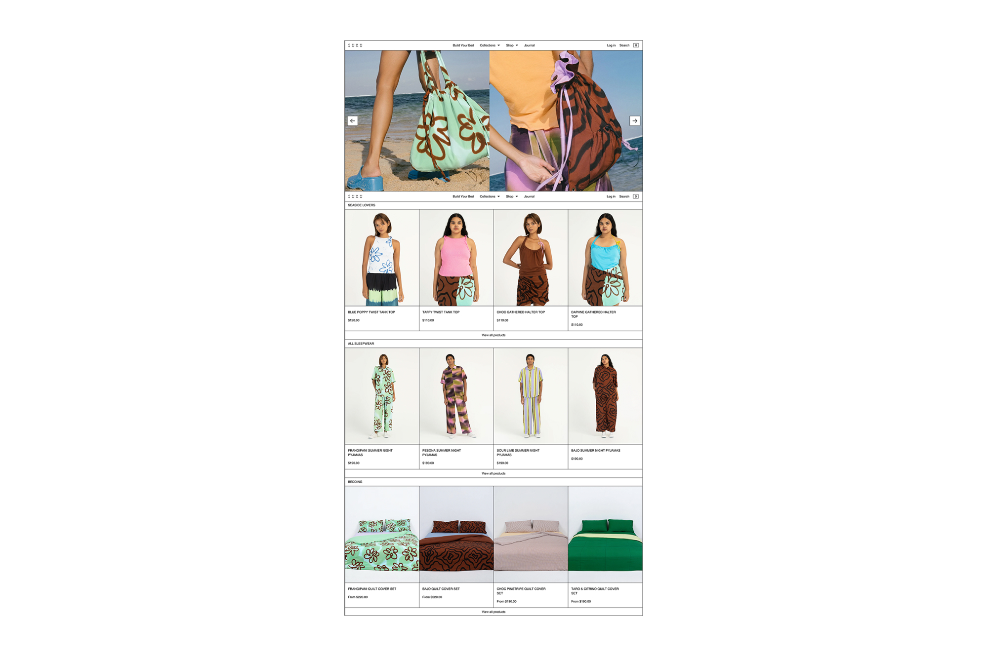
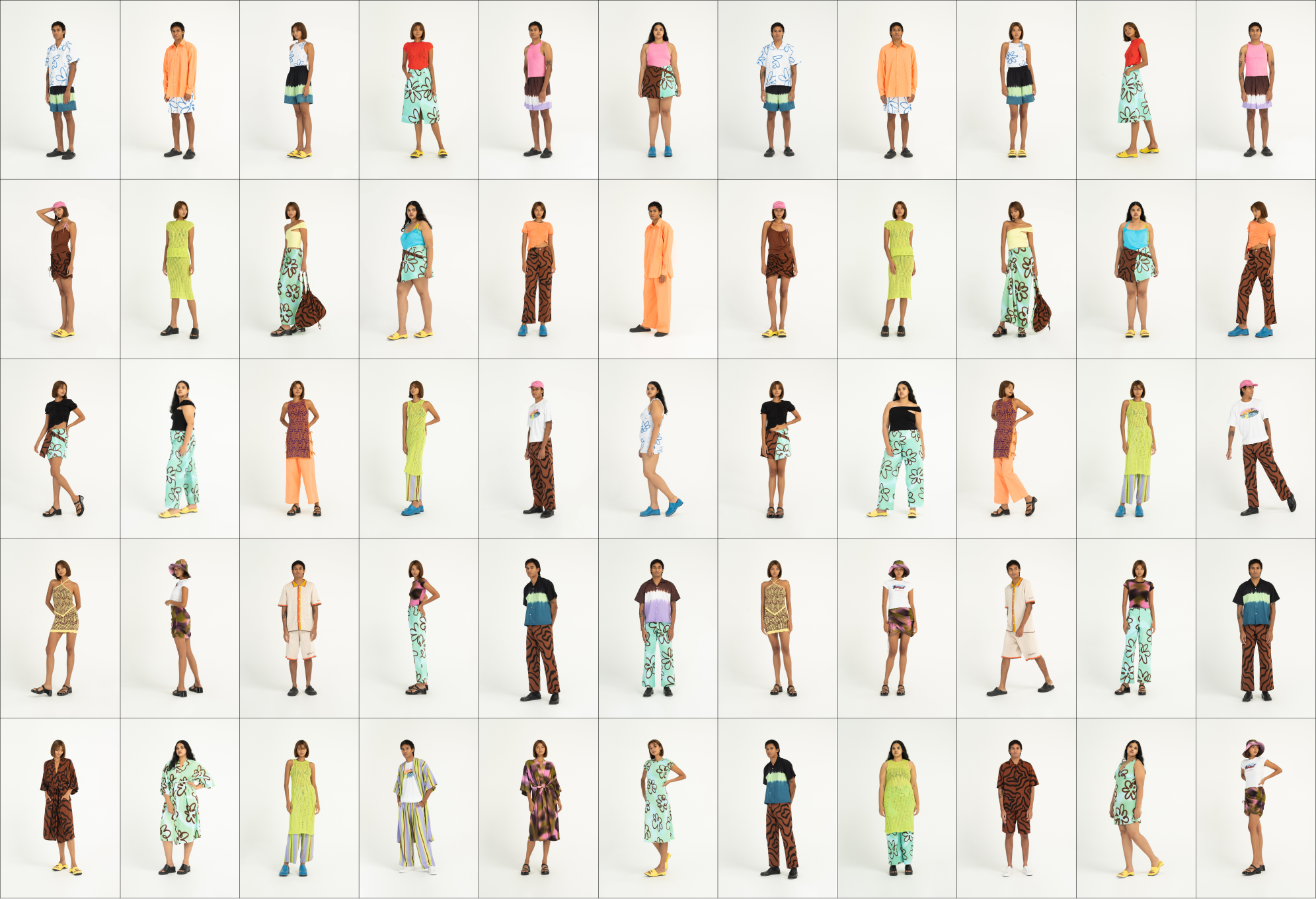
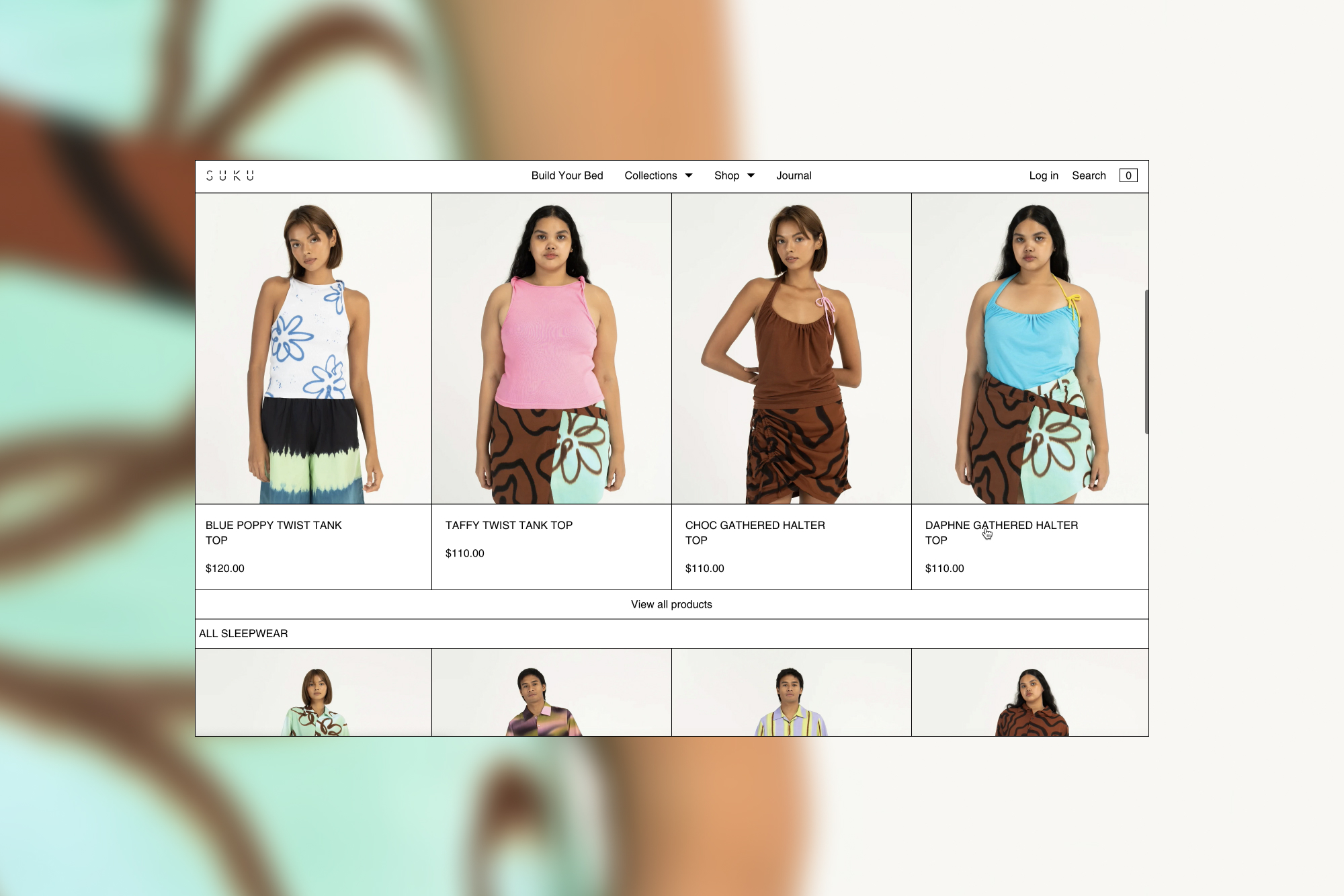
« SUKU Home is an Australian/Indonesian label that designs stunning and unique bed linen, homewares and loungeware. “SUKU is rooted in authenticity, sustainability, and connecting their global community under ethical fair trade practices and shared experiences.” — Chrissy Lafian, Founder. In 2022 SUKU expanded their brand onto apparel and accessories. To launch their brand expansion they needed a full website refresh that included a 3D Build Your Bed function. The team involved myself as creative director and web designer, my business partner as finished artist, a web developer and a 3D artist.
︎︎︎ Naarm, Australia
︎︎︎ Naarm, Australia
Melbourne Music Week ︎︎︎
Festival Branding
2021


« Play On Play (POP) was commissioned to create a fresh, reinvigorated visual identity for Melbourne Music Week 2021. The central theme was "emerging" - a celebration of Melbourne's vibrant music scene re-emerging after the extended COVID-19 lockdowns.
The key motif features a bold oval shape encircling the date, representing the long-awaited re-opening of the city post-lockdown. The text dynamically bursts forth from a grey, unknown space into a bright, colourful future. This metaphorical emergence captures the excitement and optimism of the city's music community finally able to reconnect and thrive again.
The visual identity playfully combines energetic typography with a vibrant colour palette, reflecting the uplifting spirit of the event. The simple yet impactful oval motif acts as a unifying emblem across all branding applications—from the central lockup to animated digital content and printed collateral.
︎︎︎ Naarm, Australia
︎︎︎ Photographed by Josh Robenstone
Calendar Girls︎︎︎
Branding and Film Posters
2018
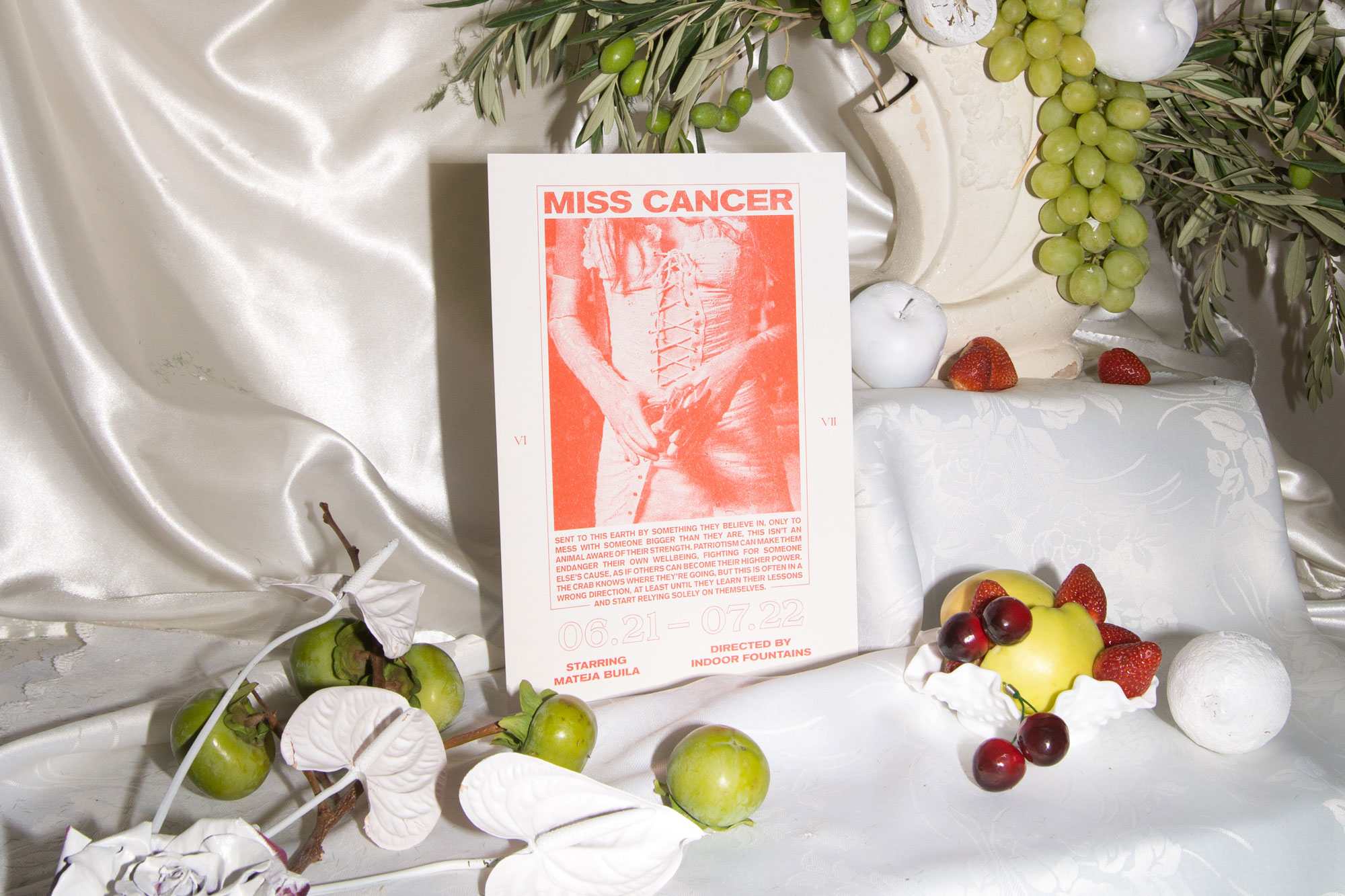
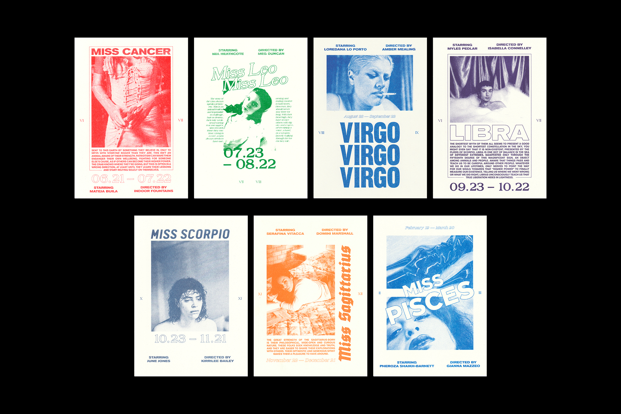

« Calendar Girls" was an ambitious 12-part film series, with each installment exploring one of the 12 zodiac signs. Our studio was tasked with creating a cohesive visual identity that would tie together the diverse aesthetics of the individual films, each directed by a different filmmaker and starring a real-life muse embodying their respective zodiac sign. Through a highly collaborative process, we designed a series of captivating title sequences and poster designs that captured the essence of each astrological sign while maintaining a unified look and feel across the entire collection.To achieve this cohesion, we employed the unique Risograph printing technique, which lent a distinctive and consistent visual texture to all 12 posters. The Risograph's vibrant yet slightly imperfect ink layering added depth and character, perfectly complementing the celestial themes and artistic visions behind each film.
︎︎︎ Naarm, Australia
︎︎︎ Styling by Xflos
︎︎︎ Produced by Amy Dellar
︎︎︎ Naarm, Australia
︎︎︎ Styling by Xflos
︎︎︎ Produced by Amy Dellar